
![]()
![]()
Standard Suite
Extensions & Plugins
Power Suite
Apps & Tools
Below you fill find a few screenshots to compare D-Type's text output with the text output of several other popular font rasterizers. For comparison purposes, only traditional grayscale rendering techniques were used (D-Type provides several additional rendering techniques that can improve the appearance of text even further but those techniques were not utilized here). Also, please note that in all cases D-Type's text is 100% auto-hinted.
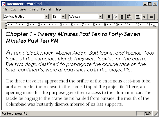
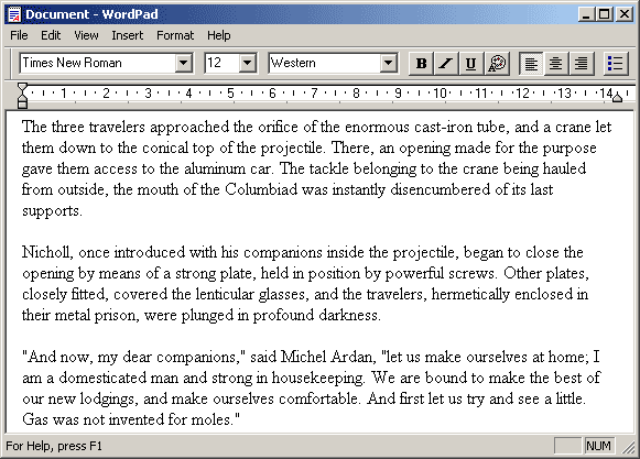
Here is some sample text in WordPad. The title and the first paragraph are set using a TrueType font called Century Gothic. The last paragraph is set using Adobe's Kozuka Mincho Pro OpenType font.
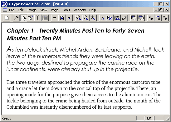
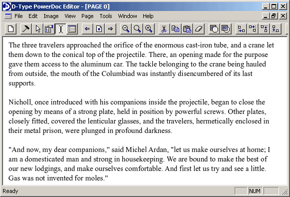
This is the same text rendered by D-Type Font Engine. We hope that you can clearly see the significantly improved and more uniform text appearance.
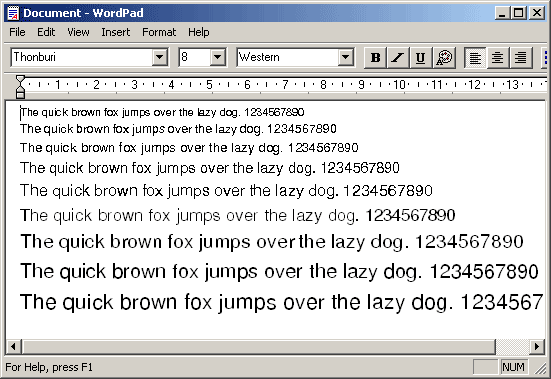
This is a TrueType font called Thonburi. We are not certain whether this font is poorly hinted or isn't hinted at all, but its screen appearance with Windows rasterizer is horrendous.
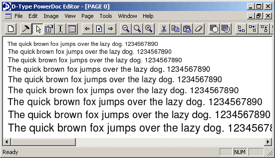
But with D-Type that doesn't matter. D-Type's built-in automatic hinting subsystem makes even the worst TrueType font look great. As we said before, all you need is a font with reasonably well constructed glyph outlines and D-Type will take care of proper hinting and high-quality rendering.
Times New Roman, probably one of the most popular fonts, is the pride of Microsoft and Monotype. These two companies, working together, spent almost two years manually instructing, hand-tuning and painstakingly delta-hinting Windows core fonts (which include Times New Roman, Arial, Courier). Still, their appearance is quite inconsistent depending on the font size: first very light, then too dark (not legible), then monochrome (jagged), and finally anti-aliased.
The same Times New Roman, but this time auto-hinted and rendered by D-Type Font Engine 4.0. As you can see, D-Type's fully automated run-time font hinting system matches or exceeds the skills of a professional typographer.
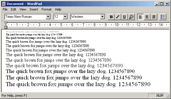
Let's take a look at a little bit more practical example. Here we see Windows rendering some text using Times New Roman at 12 points. This is probably the most frequently used size on computer screens. It is obvious that Microsoft/Monotype spent a significant amount of time instructing and manually delta-hinting glyphs at this size.
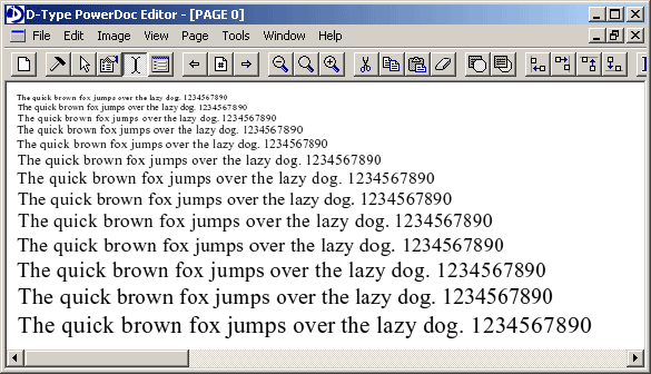
Now we see D-Type 4.0 rendering the same text, using the same font at the same size. But, of course, in this case the font is 100% auto-hinted by D-Type Font Engine at run-time. As you can see, D-Type shows once again that its automatic font hinting routines can match or exceed the skills of the best typographer. In fact, fonts that are automatically hinted by D-Type Font Engine look more natural and are more faithful to the original design than with Windows font rasterizer.
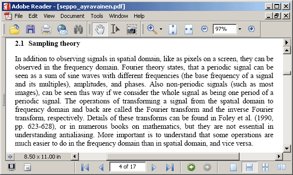
Adobe Acrobat Reader (PDF) is known for its smooth, accurate, device independent and usually good looking text output (assuming that you are using the latest 7.0 version that we used to create this screenshot).
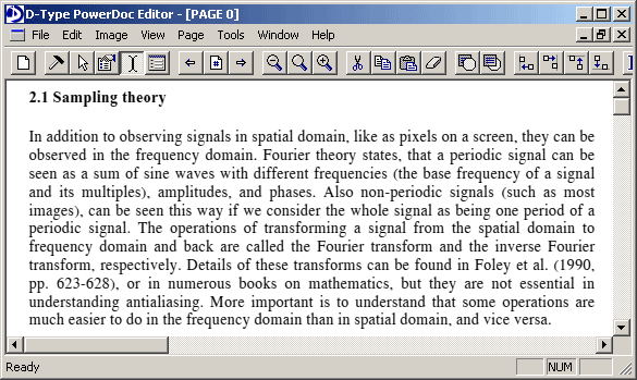
As you can see, D-Type easily matches or exceeds those qualities.
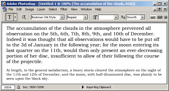
Here we see Adobe Photoshop rendering some text using fractional precision...
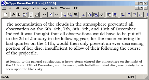
..and here we see D-Type. May be a bit difficult to see the difference, but we hope you will find D-Type's text cleaner and easier to read (especially at small size).
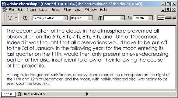
Adobe Photoshop rendering the same text as in the previous example but this time using Century Gothic. Unlike Windows font rasterizer, Adobe Photoshop always uses anti-aliasing when rendering this font (regardless of the size). But its appearance is too fuzzy.
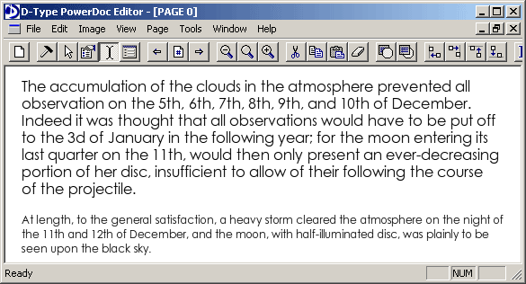
Once again, D-Type shows that the quality and clarity of this text can be improved - while still maintaining the anti-aliased look and feel.