Standard Suite
Extensions & Plugins
Power Suite
Apps & Tools
If you are a software developer and you are still using MS Windows APIs to draw device and resolution independent text (such as in PDF documents, scalable graphics or multi-media presentations), then this article is for you.
Most software developers who attempt to use various MS Windows APIs for device independent text layout, sooner or later realize that the quality and legibility of their text is not great, especially at small sizes.
Unlike D-Type Font Engine and D-Type PowerDoc Engine, MS Windows (or more precisely the TrueType rasterizer built into its Graphics Device Interface or GDI) is not suitable for rendering high-quality device and resolution independent text. When we say "device independent text" or "resolution independent text", we refer to text that is used in device independent or WYSIWYG text layout ("What You See Is What You Get"). Such text preserves its exact visual appearance regardless of the output device, resolution or magnification/zoom factor. In device independent text layout, all text formatting attributes (line breaks, justification, position of glyphs, kerning etc.) are independent of whether the text appears on the screen or in printed output. In other words, device independent text looks exactly the same on the screen as in print or any other device.
MS Windows, with certain fonts, can display nice looking text on the screen. However, there is a catch, actually a few of them:
Catch #1: Windows GDI's text is not device independent. Because glyph outlines and glyph metrics calculated by various Windows API functions change slightly when the resolution changes (due to hinting, rounding and other device specific details), line breaks can change significantly when these differences accumulate over longer runs of text. Any time you change the resolution of your text, it is very likely that your line and page breaks will change too. In fact, it is impossible to create truly device independent text using any of the Windows standard text output functions. If you want to render device independent text with Windows GDI, your only choice is to render it as an array of glyphs, one at a time. However, this approach, while mathematically sound, does not work well with Windows due to its highly device dependent system for interpreting TrueType hinting instructions. Perhaps you have already tried this approach and noticed problems. These problems usually manifest themselves in non-uniform character spacing, low output quality, poor kerning, hard-to-read text etc.
Catch #2: MS Windows can produce nice looking text only with a small number of well designed and well hinted TrueType fonts (such as Times, Arial or Verdana). These fonts use special instructions and "tricks" (such as delta-hints that are manually crafted for specific point sizes). These instructions then help generate visually pleasing glyphs on the screen. Unfortunately, TrueType hinting is very complicated and labor intensive. As a consequence, the number of high-quality well hinted TrueType fonts on the market is low. In fact, the number of non-hinted or poorly hinted TrueType fonts today greatly exceeds the number of well hinted fonts. This is not good for your users and your applications.
Catch #3: Windows APIs work on, well, MS Windows. What do you do if you need to port your application to Linux or Mac?
If your goal is to render high-quality and device independent text with any font and on any platform, then you need D-Type Font Engine or D-Type PowerDoc Engine. D-Type engines allows software developers to achieve true device independence simply and easily. This is because D-Type's architecture and unique hinting approach was specifically designed to work well with all types of WYSIWYG applications. With D-Type you can easily render text as an array of glyphs and, unlike with Windows GDI, your text will still look great. Of course, D-Type's approach supports all popular font formats: D-Type, TrueType, OpenType, Type 1, Type 3, Bare CFF.
To better illustrate why D-Type is ideal for device independent text layout (and why Windows is not), we have prepared a series of screenshots using D-Type PowerDoc Editor and QuarkXPress. In these screenshots, both applications render the same text using the same font and the same font size. However, D-Type PowerDoc Editor relies on D-Type Font Engine to render its text, while QuarkXPress relies on Windows GDI's TrueType rasterizer.
Let's first start with a sample text page displayed at a very small magnification setting (46%). Here is a sample output from QuarkXPress.
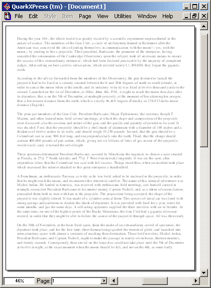
Screenshot 1-a: Windows GDI text at 46%
Can you read the above text? Well, if you try really hard, you may be able to identify or guess a few words and numbers at best. Overall, reading requires tremendous effort and guessing of words. This text is not legible.
Let's now look at the same text rendered by D-Type at the same magnification setting:
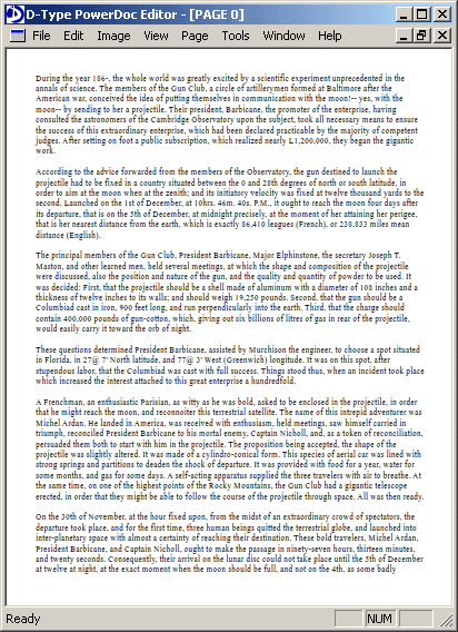
Screenshot 1-a: D-Type text at 46%
Can you read this text with D-Type? Let's see: "During the year 186-, the whole world was greatly excited by a scientific experiment unprecedented in the annals of science. The members of the Gun Club, a circle of artillerymen..." — Yes, it appears that with D-Type we can read the above text even at this very small magnification setting! True, the text is very small and we have to read it from a close distance (assuming a good quality monitor), but at least reading is possible. With QuarkXPress this was not the case — regardless of the reading distance or monitor quality. It is actually quite remarkable that D-Type makes it possible to read the whole page of text in a window whose dimensions are only 412x568 pixels. In fact, if we take another look at the above screenshot, we can see that each line of text contains approximately 110 characters while the width of the page (without margins) is 350 pixels. This means that each character in the above screenshot takes only about 3.18 (350/110) pixels in width — yes, that's only 3.18 pixels per character and our text is still readable!
Let's see what happens if we increase the magnification just a little bit — from 46% to 47%. Here is a sample output from QuarkXPress.
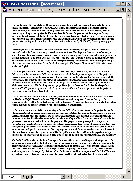
Screenshot 2-a: Windows GDI text at 47%
First of all, we can immediately notice that the whole text suddenly became much darker and heavier. Strange, it looks like TrueType rasterizer built into Windows GDI did something interesting at this size. Fine, but can we read the above text now? Let's try: "Dum?g the year 186(or is it 4)?-, the wl?le? world www? g?atly ex???? trya? sc?e???c expem?? u?qoe ??". Well, we can read more words now and a few more if we start guessing them, but the text legibility is still very poor. One thing that we can see well is the number "200,000" close to the end of the first paragraph.
Let's now look at the same text rendered by D-Type:
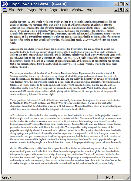
Screenshot 2-b: D-Type text at 47%
As the first thing, we can notice that D-Type's text did not become suddenly dark and heavy as with Windows GDI. The increase in size is very natural and gradual, just as you would expect. And can you read the text? Yes, it appears so: "During the year 186-, the whole world was greatly excited by a scientific experiment unprecedented in the annals of science. The members of the Gun Club, a circle of artillerymen..."
It is also interesting to note that the number "200,000" we mentioned above actually appears to be a part of the "L1,200,000" string. So whose representation is right: D-Type's or Windows GDI's? We will see this a little bit later.
Let's now increase the magnification quite a bit: from 47% to 54%. Surely at this size we should be able to read the text even with QuarkXPress! Let's see if this is really the case.

Screenshot 3-a: Windows GDI text at 54%
Interesting, it appears that the entire text appearance changed once again! The text looks quite jagged now, and the characters seem to be a little bit bigger than they should be. It looks like Windows GDI did something funny again. Fine, but can we at least read the text? Let's try again: "Du???g the year 186, the whole world was greatly exc??ed by a sc?e???c expe??ment unprecedented m?the annals of science". Well, we can read more words now and generally understand what the story is about, but we still have problems reading the text properly. Reading requires a great deal of effort and is slow. Furthermore, the text quality is poor, serifs are too prominent and they join with neighboring characters, word boundaries are not so obvious, certain characters bump into each other creating visually distracting dark spots, characters are non-uniformly spaced out and kerning is poor.
Another interesting thing: it looks like the word "L1" and number "200,000" from the previous QuarkXPress screenshot are now rendered as "L" and "1,200,000". Later, we will see that this representation is also wrong! In reality, the actual string is "L1,200,000" as shown in all D-Type screenshots.
Let's now look at the same text rendered by D-Type:

Screenshot 3-b: D-Type text at 54%
Again, no difficulties reading our sample text with D-Type. The text looks much as we would expect, no dark spots, nice character positioning and kerning, clear word boundaries.
Finally, let's increase the magnification quite a bit once again: from 54% to 66%. Here is our sample output from QuarkXPress.
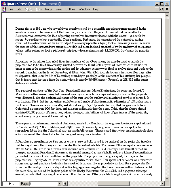
Screenshot 4-a: Windows GDI text at 66%
Finally we can read our sample text with QuarkXPress! Hurrah! But its appearance is still not great. The jagged look and feel remains. We still see how certain characters bump into each other and those same unpleasant dark spots still appear in certain places. Look for example at the strings "the", "practicable" or "L1,200,000". The text is legible but not great looking. Well, at least the representation of the "L1,200,000" string is now correct.
And if we look at the same text rendered by D-Type:

Screenshot 4-b: D-Type text at 66%
As expected, the text is legible and looks aesthetically pleasing while character positioning and kerning is perfect. And note that at this magnification setting the text size is still smaller than in the window title or menu bar which is generally accepted as the optimum reading size on today's monitors. At bigger sizes D-Type's text looks even better and becomes even crisper and easier to read.
With D-Type device independent text looks nice and is legible; we were able to read our sample text in all four screenshots. With Windows GDI, however, the text didn't look great in any of the screenshots; we could read properly only the text in the last screenshot. Furthermore, its poor character spacing and kerning caused confusion in some places (for example the string "L1,200,000" was in one case rendered as "L1" and "200,000" and in the other case as "L" and "1,200,000").
With D-Type the weight of the text and the overall look and feel of the document is very consistent regardless of the magnification or resolution. With Windows GDI, however, the look and feel was changing (quite dramatically and inconsistently) as we were changing the magnification setting.
D-Type offers many different text display, hinting and filtering options. All of the above D-Type screenshots were rendered using one particular option. There are additional display, hinting and filtering options which might work even better with certain types of devices. For example, here is the previous D-Type text sample rendered using a method which puts a little bit more emphasis on the sharpness of output and less on accurate positioning:
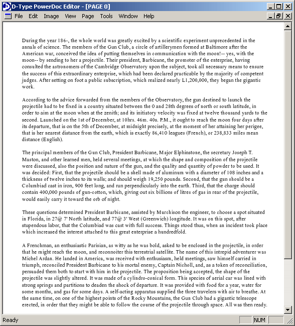
Screenshot 5: D-Type text at 66% — alternative version A
Or, here is the same text sample rendered using a method which puts a little bit more emphasis on accurate positioning and less on the sharpness of output:

Screenshot 6: D-Type text at 66% — alternative version B
Regardless of which method your prefer, we hope you will agree that in all cases the resulting text output is noticeably better and more naturally looking than with Windows GDI.
Some of the problems that Windows GDI revealed — poor text quality, too prominent serifs that join with neighboring characters, unclear word boundaries and joined characters, visually distracting dark spots — are actually typical and expected when a highly device dependent hinting system is used to render device independent text layout. These problems are not specific just to QuarkXPress, they also affect many other MS Windows applications.
However, when the text is rendered by a font rasterizer whose hinting system was designed to be device independent from ground up, such as D-Type's, then most of these problems disappear. In fact, text rendered by D-Type Font Engine and D-Type PowerDoc Engine looks quite nice and legible, even at very small sizes.