
![]()
![]()
Standard Suite
Extensions & Plugins
Power Suite
Apps & Tools
All images on this page are rendered by D-Type PowerDoc Engine using 100% auto-hinted TrueType, Type 1 and D-Type fonts.
Written text is probably one of the most important inventions of modern society. After all, we use text on a daily basis to represent, communicate, exchange and store all types of information: ideas, knowledge, poetry, history, recipes, letters, e-mail messages, algorithms, computer programs etc. In fact, it is virtually impossible to imagine a computer application that doesn't utilize text in some way.
Interestingly, it appears that many software developers are initially unaware of numerous complexities associated with text rendering. They often see text representation (Unicode standard) and text rendering as one thing. Or, they sometimes believe that all text can be rendered in a simple linear progression as a sequence of individual characters. While this simplified method was acceptable in some applications that predate Unicode or on systems with limited text rendering capabilities, today our requirements are different. Not only do we expect crisp and highly legible text, we also need rich text, advanced formatting capabilities, device independent and/or device dependent text layout, international (complex) scripts with bidirectional layout, the ability to mix text and graphics, tables, formulas etc. Once all these requirements are considered, it is obvious that text rendering is a complex and specialized function.
To give you a better idea of some of the challenges that text rendering engines must overcome, have a look at the following figure. You will see that rich text is more than just applying different sizes and styles to different characters. We frequently need to include mathematical formulas and tables, which consist of more text. We would like to support complex international scripts such as Indic, which use complex shaping rules to properly display the words. We also want to support right-to-left scripts such as Arabic, which are right justified and frequently include embedded left-to-right text fragments. And, of course, we need to support proper cursor movement and text selections within these complex structures.
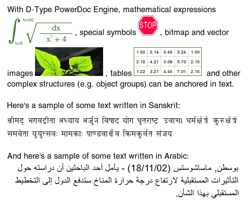
Here is an example of rich text layout rendered by D-Type PowerDoc Engine.
Can your application support all of the complexities associated with text rendering?
D-Type provides a solution to the above challenges. The purpose of this document is to provide a brief overview of the most important text rendering algorithms in D-Type Engines and explain how to make your text look great with D-Type Font Engine and D-Type PowerDoc Engine.
One of the most important considerations concerning text layout on raster devices is whether we would like to support device dependent or device independent text layout. While D-Type provides a solution for both, it is important to understand the difference between these two concepts.
Device dependent text layout uses metrics of a particular device at a particular resolution and zoom factor. This means that device dependent text is optimized to look great at that particular resolution and zoom factor. Consequently, at any given size, device dependent text usually looks better than the corresponding device independent text at that same size. However, device dependent text has one potential drawback: when the resolution or zoom factor changes, text metrics change as well. This change can have a number of unwanted side effects. For example, the length of text lines (expressed in pixels) is not proportional to the zoom factor — sometimes one text line may appear either noticeably shorter or noticeably longer than the other one. Or, two characters that are located at the same X coordinate but on two different text lines do not line up accurately at certain zoom factors. Consequently, in many applications that use device dependent text layout, a change in resolution or zoom factor usually causes line breaks, justification and/or position of characters to change as well.
On the other hand, device independent text is designed with the WYSIWYG text layout in mind ("What You See Is What You Get") regardless of the output device, resolution or zoom factor. In device independent text layout, all the text formatting attributes (line breaks, justification, position of glyphs, kerning etc.) are independent of whether that text appears on the screen or in printed output. In other words, device independent text looks exactly the same on the screen as in print or any other device. Characters that are supposed to line up really line up (at any resolution or zoom factor); the length of all the text lines (expressed in pixels) is directly related to the resolution or zoom factor. For example, it the zoom factor increases two times, the length of all the text lines (again, in pixels) will increase precisely two times. However, in order to preserve its device independence, device independent text cannot take advantage of any device optimized metrics that can improve the appearance and legibility of text. In fact, with ordinary text rendering engines, device independent text usually looks very unpleasing when displayed at small sizes. For more details on this topic, please see the related document Why is D-Type Ideal For Device Independent Text Layout? This is the main drawback of the device independent text layout. Although this drawback is only noticeable when the text is displayed on raster devices with low resolution such as computer monitors, this is still a big issue since we spend lots of time reading text from these devices.
The drawbacks we just described are true for most text layout engines. D-Type Engine, however, solves many of these problems. With D-Type, device independent text looks virtually as good as device dependent text. Many users won't even know whether they are reading device dependent or device independent text. At the same time, D-Type makes it possible to create great looking device dependent text by using any properly constructed font. With D-Type, you don't need to buy expensive TrueType fonts with manually hinted glyph outlines and tables optimized for specific devices to take advantage of high quality device dependent text rendering.
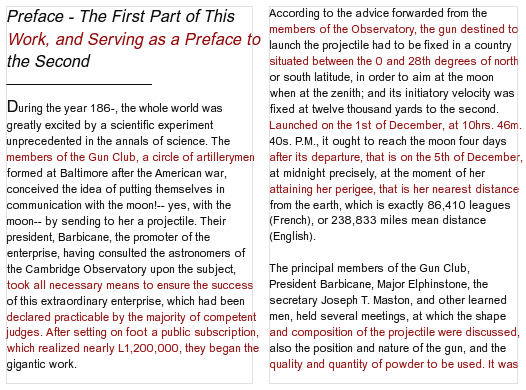
To better understand the differences between device dependent and device independent text layout, please take a look at the following illustration:
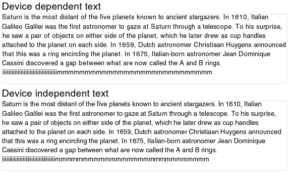
An example of device dependent (top) and device independent (bottom) text layout.
The top portion of the above illustration shows a sample text paragraph in a device dependent text layout. The bottom portion shows that same sample in a device independent text layout. While preparing these two illustrations, we used two little tricks: Firstly, we included a repetitive sequence of characters "i" and "m" at the end of each sample paragraph. This makes it easier to observe the spacing between characters of the same width and how this spacing changes as the resolution or zoom factor changes. Secondly, we rendered the bottom sample using a method that actually makes it easier to observe irregularities in spacing between characters of the same width. Because of this, the top sample should look slightly better than the bottom sample.
So, if you look at the above illustrations once again, you can see that the spacing between characters in the top sample is very uniform (again, look at the series of characters "i" or "m") thanks to device optimized metrics. This is not the case with the bottom sample. However, the bottom sample is mathematically more accurate and matches closely the printed output. For example, if you look at the word "announced" at the end of the fourth text line, you will see that in the top sample this word almost touches the right edge of the rectangle. In reality, we know that this word is not supposed to come so close to the right edge. This suggests that the top text sample is rendered using a device dependent method, while the bottom sample is rendered using a device independent method.
Let's see what happens to our text samples if we change the zoom factor (or resolution) of the device. We will decrease the magnification by approximately 17%. The result is shown in the following illustration.
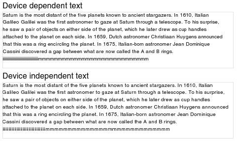
Device dependent (top) and device independent (bottom) text layout at reduced magnification.
As before, the top sample should look slightly better than the bottom one due to device specific metrics. However, it also confirms the main drawback of the device dependent text layout: when the resolution or zoom factor changes, text metrics change as well. Look again at the word "announced" at the end of the fourth text line. This word is now much farther from the right margin; the whole text line is shorter than before (and is also sorter than what it should be). Or, if you look at the sequence of characters "m" on the last line, you will see that this sequence now ends below the word "and". However, in the first illustration (in which the zoom factor is 17% larger), that same sequence ends below the word "rings". But this drawback does not affect the sample in the device independent text layout. This sample always looks the same, regardless of the zoom factor (or resolution).
Before we move on to the next section, let's just say that with D-Type there is more than one way to accurately render device independent text. What we have just shown above is one method. This method makes it easier for us to demonstrate that we are rendering device independent text. However, D-Type offers a few alternative methods to render device independent text which, in most situations, can produce even more accurate character spacing and better looking device independent text. Have a look:
Alternative Method #1

Alternative Method #2
Device dependent text layout is typically the best choice for applications that require the highest output quality and target one specific device (usually a computer screen) and/or are not really concerned with whether the text output on one device (e.g. monitor) will match the output on another device (e.g. printer). Potential applications include text editors (but not text processors), e-mail message composers and readers, video games, user interface, GUI widgets, screen-only forms and presentations and similar applications.
For example, the following illustration shows that device dependent rendering helps improve the legibility of computer programs. In fact, any text editing application that is not concerned with the WYSIWYG text layout might want to take advantage of device dependent text rendering.
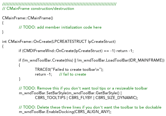
Device dependent text layout, as shown above, is very suitable for text editing applications.
Device independent text layout is usually the best choice when rendering text that must preserve its exact visual appearance (line breaks, justification, position of glyphs, kerning etc.) on any device and regardless of the resolution or zoom factor of the device. Typical examples include text processors, desktop publishing applications, PDF readers, printable forms and documents, diagrams, charts and presentations (so that text always lines up with graphical elements) and other types of WYSIWYG applications.
For example, the following illustration shows why device independent text layout is sometimes a must. In this illustration we would like to preserve spacing between characters and line breaks accurately. We don't want to completely reflow our text each time the zoom factor or resolution changes. But we don't want our text to run into Saturn and ruin our entire presentation either. In other words, we want this presentation to look exactly the same on all devices, at all resolutions and all zoom factors.
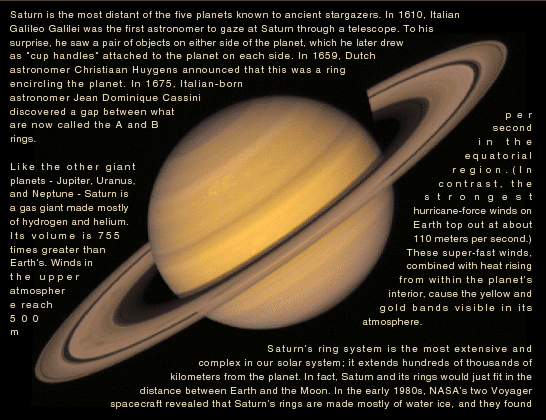
Device independent text layout, as shown above, is very suitable for WYSIWYG applications.
D-Type PowerDoc Engine also provides a special text rendering mode called mixed mode. This mode was specifically designed to give beautiful text output and, at the same time, eliminate some of the drawbacks associated with both the device dependent and device independent text mentioned earlier in this document.
Mixed mode, as the name implies, represents a mix of device dependent and device independent rendering methods. Ideally, we want to render all text lines in a device dependent manner so that we can take advantage of device optimized metrics and improve the appearance and legibility of our text. But, at the same time, we don't want any of our text lines to become too long and exceed the width of their enclosing rectangle (i.e. we want to avoid one of the main drawbacks of the device optimized metrics). In other words, we want to make sure that our text always stays within the boundaries of the enclosing rectangle.
Mixed mode was specifically designed with this goal in mind. In this mode, D-Type Engine will first attempt to render all text lines in a device dependent manner. If, during this process, the length of the currently processed text line does not exceed the width of the enclosing rectangle (which is a favored outcome), then the engine will complete the rendering of that text line in a device dependent manner. However, if the length of the currently processed text line does exceed the width of the enclosing rectangle (which fortunately happens far less frequently), then the engine will render that particular text line in a device independent manner. In this way, mixed mode guarantees that all of our text lines will always fit within the boundaries of the enclosing rectangle — regardless of the device, resolution or zoom factor.
We can simplify the above explanation by stating this: In mixed mode, most text lines are rendered in a device dependent manner; only those text lines that are too long to fit within the enclosing rectangle are rendered in a device independent manner. This makes sense because for many applications great looking text that respects the boundaries of the enclosing rectangle is more important than the true WYSIWYG capability that the device independent mode provides.
To better understand this concept, have a look at the following illustration.
Text rendered in a device dependent manner.
Some text lines (indicated in red) touch or exceed the width of their enclosing rectangle.
In the above illustration, all the text lines (in both columns) are rendered in a device dependent manner. As a result, some text lines touch or exceed the width of their enclosing rectangle. Those text lines are shown in red. In mixed mode, however, those red lines will be rendered in a device independent manner. The is shown in the following illustration:

Text rendered in the mixed mode. Now all text lines fit within their enclosing rectangle.
The above illustration confirms that in mixed mode most text lines are still rendered in a device dependent manner. However, those text lines that used to be in red are now rendered in a device independent manner. As a result, all the text lines now fit within their enclosing rectangle. And, as a bonus, text lines rendered in a device dependent manner mix very nicely with text lines rendered in a device independent manner. The final output looks nice and hardly shows any drawbacks of the device dependent and/or device independent rendering methods. When reading the above text, everything looks quite uniform and natural.
Mixed mode, while very useful, will not be further discussed in this document. It is only mentioned here so that software developers who use or would like to use D-Type PowerDoc Engine know that there is yet another great method to render highly legible text. More details about this mode can be found in our Guidelines For Creating PowerDoc Objects.
As the name suggests, D-Type Font Engine primarily deals with fonts (in any popular font format) which includes processing and retrieving information from font files and, of course, rendering glyph outlines contained within these font files. Also, D-Type Font Engine comes with an optional Text Layout Extension, which uses information found in font files in conjunction with generic knowledge of the Unicode standard to properly shape complex scripts such as Arabic, Indic or Thai.
Although D-Type Font Engine and its Text Layout Extension do not deal directly with rich text and/or advanced text layout, both engines provide low level functions to render high quality text (in both device dependent and device independent manner) and provide developers with a good starting point for building higher level APIs (usually application specific) necessary to implement sophisticated text layout rendering capabilities.
Developers who only license D-Type Font Engine and its optional Text Layout Extension can use two different strategies to render text:
Render text as a sequence of glyphs (or characters) by repeatedly calling the engine's glyph (or character) rendering functions. Although glyph indices are font specific, rendering individual glyphs is usually more flexible than rendering individual characters since the Text Layout Extension always returns its output as an array of glyphs. Thus, if you need to render complex scripts such as Arabic, Indic or Thai, you can first pass your initial sequence of Unicode characters to the Text Layout Extension. When all the complex shaping rules are applied, the Extension will return to you an array of glyphs to display in the correct visual order. Then, your task is to render those glyphs one by one and, during this process, apply your own rich text formatting and layout algorithms. In other words, you are entirely responsible for making decisions about how and when to apply different fonts, sizes and styles, whether to use device dependent or device independent text layout, how and when to do text alignment, justification and any other text layout related tasks. While some developers will like the flexibility and freedom that this method provides, it is obvious that this approach assumes that a lot of text processing work is done by your application. And if this sounds like a lot of work, then move on to the next chapter: Rendering Text With D-Type PowerDoc Engine.
To assist with some low level text layout tasks (i.e. glyph/character spacing and kerning, device dependent and device independent rendering, transformation matrices) you can use the dtxCharsDoOutput and dtxGlyphsDoOutput functions. These functions can accept either an array of characters or an array of glyphs as the input. Again, rendering an array of glyphs is usually more suitable than rendering an array of characters, especially when the Text Layout Extension is used to assist with complex script shaping. Once your text has been converted from an array of Unicode characters to an array of font dependent glyph indices, the dtxGlyphsDoOutput functions will render the entire text line using a single font, size and style. Consequently, even with this approach, you are still responsible for breaking rich text lines into fragments of the same font, size, style and directionality and you are still responsible for many text layout related tasks such as alignment and justification. However, since the dtxCharsDoOutput and dtxGlyphsDoOutput functions are provided in source code format, you are free to build your own higher level text rendering APIs on top of these base functions or modify them to better suit the needs of your own application(s).
When drawing text using D-Type Font Engine, the engine's output parameters are controlled by calling the Typesetter. The Typesetter provides a rich set of functions to independently control the quality of the output, sub-pixel precision (whole pixel or fractional), hinting, filtering and many other font rendering parameters. For example, if you wish to render device dependent text, you will probably want to enable font hinting. If, however, you wish to render device independent text, you will probably want to turn the fractional precision on and either enable or disable font hinting. When the hinting is enabled, the output will be more crisp; when the hinting is disabled, the sub-pixel accuracy will be improved.
D-Type PowerDoc Engine provides a single but easier and more sophisticated approach when it comes to text rendering. With D-Type PowerDoc Engine, almost everything is done by the engine; you are only responsible for creating text objects. You can create simple text objects or rich text objects with complex shaping rules, embedded sub-objects etc.
A great thing about this approach is that D-Type PowerDoc Engine takes complete care of text formatting, processing, layout and rendering. Before or after rendering, you can get information about how and where the individual glyphs are (or will be) positioned using a concept called Frames (not discussed in this document) so that you can easily implement your own cursor movement and text selection routines. Of course, D-Type PowerDoc Engine can render both device dependent and device independent text. On top of this, D-Type PowerDoc Engine also implements a number of proprietary text rendering algorithms for enhanced text layout mentioned above. These algorithms are not available in D-Type Font Engine because D-Type Font Engine is not a text layout engine.
The smallest unit of text in D-Type PowerDoc Engine API is called a text fragment. The text fragment is a run of text in the same font, size, style, direction, shaping and other formatting attributes. The entire rich text object to render is simply a sequence of linked text fragments and some initial (global) text properties.
To illustrate some of D-Type PowerDoc Engine's powerful features, we will skip the technical explanations and jump to an example. This example will show you, step by step, how easy it is to create high quality rich text objects using D-Type PowerDoc Engine. We will also take advantage of the PowerDoc Editor to rapidly build our text object. Once we are done, we will simply export the result of our work to C/C++ source code.
Step 1: Launch PowerDoc Editor, switch to Place Mode by clicking the "hammer" icon in the toolbar. Then, move your mouse pointer over an empty area on the current page and click with the left mouse button to indicate where on the page to place your rich text object. The Place PowerDoc Template dialog box will appear as shown below.

Place a rich text object on the current page.
Step 2: Select the Rich Text Area template and choose Empty as illustrated above. Click the OK button. This will create an empty rich text area on the page which is shown below.
An empty rich text area is created on the page.
Step 3: Switch to Text Mode by clicking the "text cursor" icon in the toolbar, then click within the newly created rich text area and start typing your text.
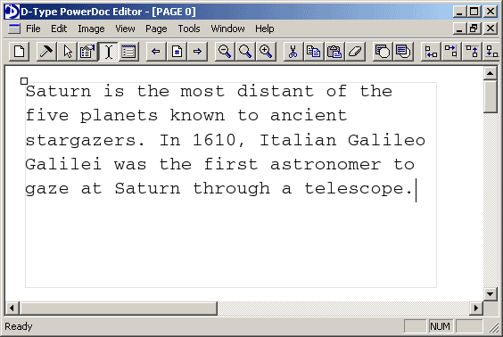
Enter some text within the newly created rich text area.
Step 4: Select your entire text (you can press Ctrl+A) and, while the selection is active, right click with your mouse button to activate the Text Format dialog box.

Text Format dialog box - select font
We want to change the font to Arial, so click the Font tab and select Arial. We also want to change the font size, so click the Size/Transform tab and specify the size of 16 document units. This is shown below:
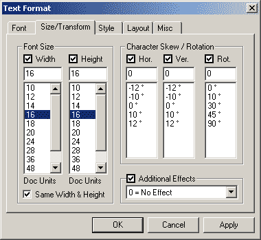
Text Format dialog box - select font size
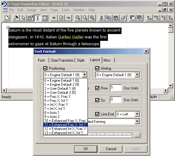
Finally, we want to change the spacing between text rows to 5 document units and enable kerning. Therefore, click the Layout tab and enter 5 in the Row Spacing field and select Enable Standard Kerning in the Kerning field. This is illustrated below:
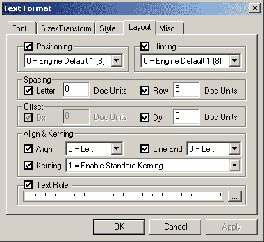
Text Format dialog box - specify text layout parameters
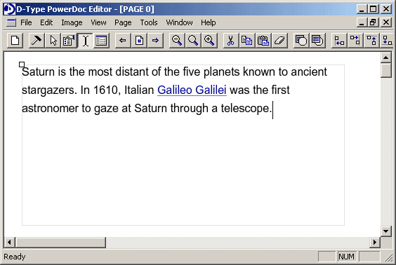
After clicking the OK or Apply button, our text will look as follows:

Text after applying initial text format attributes
Assume that we want to format the word Galileo Galilei to look like a hyperlink. In other words, we want to make it underlined and change its color to blue. Therefore, select the word Galileo Galilei and, once again, right click the mouse button to activate the Text Format dialog box.

Text Format dialog box - additional effect
This time click the Size/Transform tab and under Additional Effect choose Underline. Next, click the Style tab and click the More button (represented by three dots) next to the RGBT field under Layer 2: Body. This will open the Style Generator dialog box as shown below:

Style Generator
Increase the intensity of the blue color component to 165 and press the OK button to return to the Text Format dialog box. The selected color value is automatically copied to the RGBT field under Layer 2: Body. Click OK once again to apply your changes. The result is shown below:
Text after applying additional text format attributes
By default, all text objects created by D-Type PowerDoc Editor are rendered in a device independent manner. For example, if we decrease the zoom factor (by clicking the Zoom Out icon in the tool bar), we can see that our line breaks, justification, position of glyphs and kerning are preserved accurately.
Text after decreasing the zoom factor
In addition, text areas created by PowerDoc Editor use fractional character positioning for improved precision and font hinting for crisper output. However, the proprietary text rendering algorithms for enhanced text layout that we mentioned earlier are not enabled by default. We want to enable them too. So, once again, select the entire text and right click the mouse button to activate the Text Format dialog box. Then click the Layout tab and choose the Enhanced Frac X, Int Y option from the Positioning pull down menu. This is shown below:
Text Format dialog box - enhanced fractional positioning
Click the OK or Apply button to apply the changes. You will notice that our text output has now become even better:
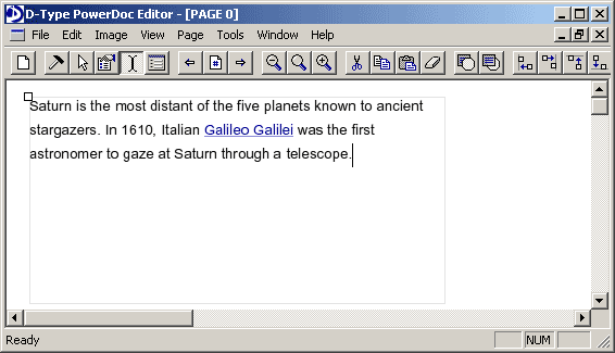
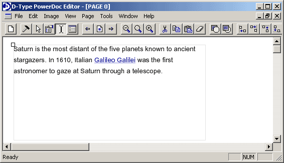
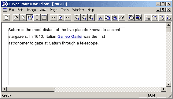
Text after applying the enhanced fractional positioning
In particular, if you carefully examine the above screenshot and compare it with the previous one, you can see that character spacing in words "distant" and "Galileo" has been improved. More precisely, the gap between letters "d" and "i" in "distant" has been reduced; similarly the gap between letters "l" and "i" in "Galileo" has been reduced too. Our text now looks really good.
While we can't easily demonstrate on this page, you can be confident that our text looks great at any magnification setting. This is thanks to automatic font hinting, fractional character positioning and the proprietary text rendering algorithms for enhanced text layout. All of these algorithms work together to give you the best text reading experience possible in a device independent manner.
But let's assume that we want to improve the appearance of our text even further by switching to a device dependent text layout. To do this, first switch to Edit Mode by clicking the "property sheet with pointing hand" icon in the toolbar. Then click with the left mouse button on the origin point of the text area, which is located in its top left corner. The Object Builder dialog box will appear. Object Builder allows you to access and change any property of any PowerDoc object regardless of how complex it is. In addition, Object Builder makes it possible to manually create completely new PowerDoc objects from scratch in accordance with Guidelines For Creating PowerDoc Objects.
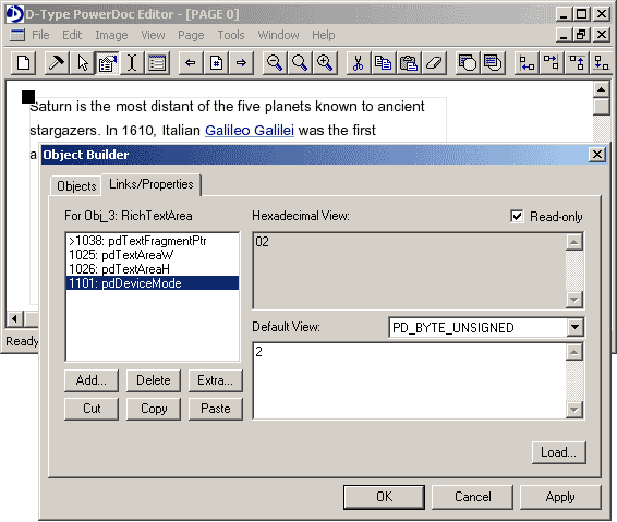
Object Builder dialog box
In this case we only want to modify the property called pdDeviceMode since this is the property which tells the engine whether to render text in a device dependent or device independent manner (more information on pdDeviceMode as well as other PowerDoc properties can be found in Guidelines For Creating PowerDoc Objects). When the value of the pdDeviceMode property is set to 0, which is also the default value, the engine will render text in a device independent manner. However, when the value of this property is set to 1 or 2, the engine will render text in a device dependent manner. The value 1 specifies Device Dependent Mode #1, while the value 2 indicates Device Dependent Mode #2. Without getting into details, we simply want to use the second mode, so let's change the value of the pdDeviceMode property to 2. This is shown in the previous illustration.
Finally, click the OK or Apply button, and you will be pleasantly surprised with the result:
Text after switching to a device dependent rendering mode
Our text now looks perfect. Granted, this text layout is no longer device independent but maybe for our application this isn't really important. However, the spacing between all the characters looks very nice while the shape of all the characters is consistent and uniform.
Now that we are completely satisfied with the appearance of our text, we want to export this simple D-Type PowerDoc Engine document to C/C++ so that we can further manipulate the structure of our text object and its content through code.
But before we proceed with the export, let's first select the Document Optimizer feature from the Tools menu. This will open the Optimizations dialog box. Our goal is to simplify the structure of our D-Type PowerDoc Engine document as much as possible so that the resulting code is as simple as it can be. Therefore, check the following options: 1) discard empty text fragments, 3) perform link optimization for the entire document and 4) discard unreferenced objects. Also, check the Multi-pass optimization checkbox. Essentially, we are performing garbage collection in the document and replacing any multiple instances of the same object with a single instance.
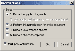
Optimizations dialog box
The optimization process will only take a second or so. When it's done, you will see a summary report that might look similar to the following:
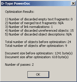
Optimization Results dialog box
Finally, we are ready to export our document to C/C++. To do so, go to the File menu, select Save As C/C++ Source and choose the All Code in C/C++ option since we want to have all the source code exported (as opposed to saving the document in D-Type PowerDoc Engine format and just exporting the code containing a reference to this document). This is shown below:
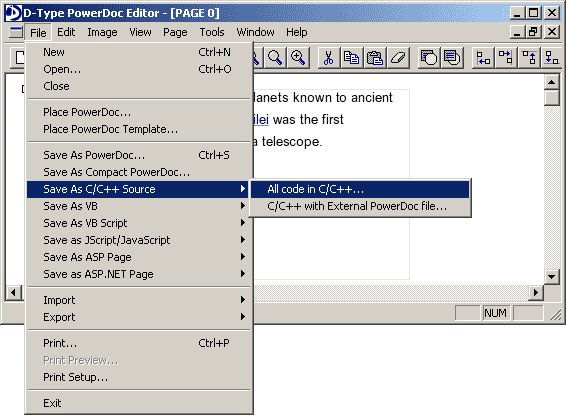
Save As C/C++ Source export option
As the last step, select a file name for your C/C++ file and click the Save button. The source code is now saved on your hard disk.
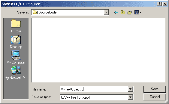
Save the C/C++ file
You are probably curious to find out what the resulting source code looks like? Well, we will not reveal this here. We invite you to download and evaluate D-Type PowerDoc Engine and find this out yourself. We will only say that the resulting source code contains 9 PowerDoc objects, 1 of which is the rich text area itself, 3 are text fragments, while the remaining 5 objects control typography, layout and style of different text fragments.
We hope that this document has provided some insight into text rendering algorithms and explained how to approach text rendering and text layout with D-Type Font Engine and D-Type PowerDoc Engine. As it can be seen, D-Type PowerDoc Engine was specifically designed to make it very easy to create and render great looking rich text. And by taking advantage of D-Type PowerDoc Editor, programmers can build the skeleton of their entire text document using visual tools and export the result of their work as C/C++ source code. This makes it possible to further manipulate the structure and content of the text document from within an application.
Our future documents will cover some of the more advanced topics: How to embed tables, pictures and other custom objects in text, how to format bidirectional text and apply shaping engines for complex scripts, how to create linked text areas and finally how to retrieve Frames associated with the rendered glyphs (so you can easily implement your own cursor movement and text selection routines).